The psychology of fonts refers to how different font styles influence the emotional and visual responses of readers. Since about 90% of the information processed by the brain is visual, fonts play a crucial role in shaping perception and behavior. Fonts can evoke specific feelings and associations, making them a powerful tool in communication and branding.
- Visual and Emotional Reaction: Fonts can trigger subconscious reactions, influencing how people feel about a message or brand.
- Nonverbal Communication: According to Albert Mehrabian’s Rule, 93% of personal communication is nonverbal, which includes typography.
- Example: A slender font used in a slimming product’s branding can visually reinforce the idea of thinness and elegance.
Typography: The Art of Visual Meaning
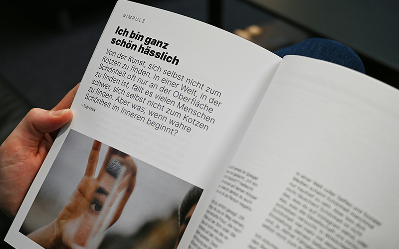
Typography is more than just choosing a font; it’s about creating a visual experience that conveys meaning and emotion. The arrangement of letters, spacing, and case can all affect how a font is perceived.
- Playfulness: Using uppercase or lowercase letters and adjusting spacing can evoke different moods.
- Brand Identity: Typography helps build a brand’s personality and emotional connection with its audience.
Shape and Color Psychology in Fonts
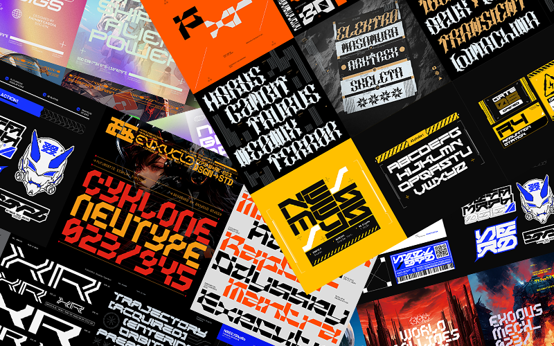
- Shapes: The form of letters can evoke specific feelings (e.g., rounded fonts feel friendly, sharp fonts feel professional).
- Colors: Colors combined with fonts amplify emotional responses and communicate brand values.
Why Is Font Psychology Important?
Understanding font psychology allows designers and businesses to:
- Choose fonts that align with brand values and desired emotional responses.
- Enhance brand recognition and memorability.
- Control how messages are perceived and accepted by the audience.
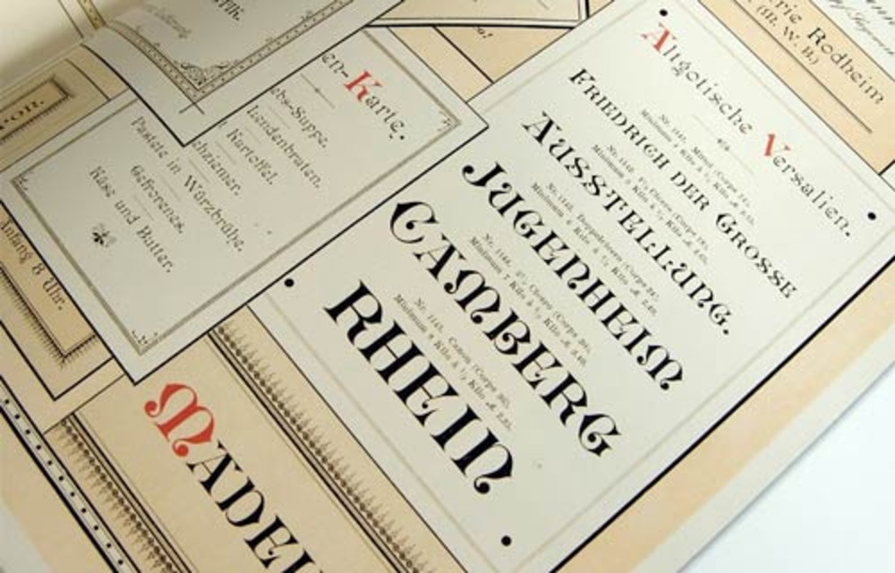
Example: Serif and Sans Serif fonts can evoke sophistication and modernity, respectively, which is crucial for luxury or tech brands.
Important Factors When Choosing Fonts
| Factor | Description | Examples/Notes |
| Branding | Fonts should reflect the brand’s character and values. | Bold fonts for fitness brands, elegant fonts for luxury brands. |
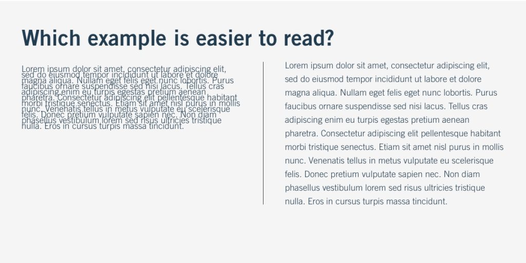
| Legibility | Fonts must be clear and easy to read across sizes and devices. | Avoid overly decorative fonts for body text; test on small screens. |
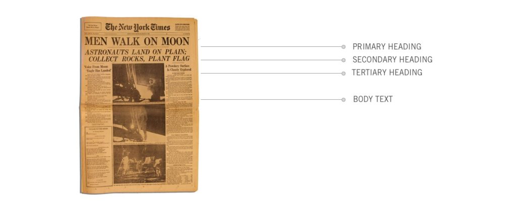
| Serif vs Sans Serif | Serif fonts are traditional and good for long texts; Sans Serif fonts are modern and clean. | Safe Serif: Times New Roman, Georgia; Safe Sans: Arial, Verdana. |
| Font Family | Use fonts from the same family for consistency; families include Serif, Sans, Cursive, etc. | Serif: Garamond; Sans: Helvetica; Cursive: Comic Sans; Fantasy: Cottonwood; Monospace: Courier. |
| Limit Number of Fonts | Use 2-3 fonts per design to avoid visual clutter. | Use size, weight, or color variations instead of multiple fonts. |
| Avoid Similar Fonts | Don’t use fonts that look too alike to prevent clashing. | Avoid pairing Times New Roman with Merriweather. |
| Decisive Contrast | Fonts should contrast in weight, style, or angle but still harmonize. | Pair a bold serif with a light sans serif for balance. |
Emotional Responses Behind Major Font Categories
| Font Category | Emotional Impact & Usage | Examples of Brands Using These Fonts |
| Serif | Traditional, trustworthy, formal, authoritative. Ideal for finance, law, and insurance. | Vogue, Wikipedia, HSBC, Tiffany & Co., Rolex |
| Sans Serif | Modern, clean, straightforward, innovative, tech-savvy. Great for digital and fashion. | Google, Apple, Nike |
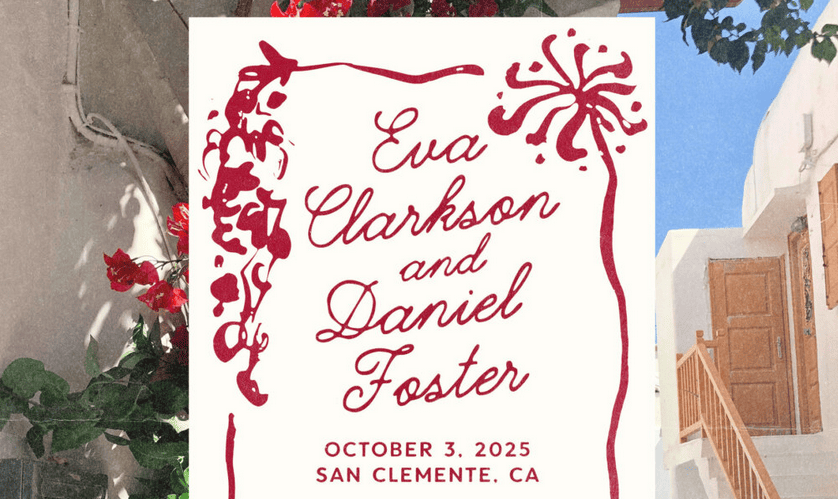
| Script | Elegant, sophisticated, personal, artistic. Often used for luxury and creative brands. | Coca-Cola, Instagram (in some branding elements) |
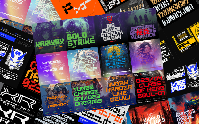
| Fantasy | Decorative, playful, unique, and eye-catching. Suitable for entertainment and children. | Cottonwood, Alpha Geometrique |
| Monospace | Technical, retro, typewriter-like, precise. Used in coding and tech-related contexts. | Courier New, Consolas |
Summary and Practical Recommendations
- Understand your brand’s personality and target audience before selecting fonts.
- Prioritize legibility to ensure your message is easily understood.
- Use font psychology to evoke desired emotions and reinforce brand values.
- Limit font variety to maintain visual coherence.
- Pair fonts with contrasting but harmonious characteristics to create visual interest.
- Consider the medium (print, web, mobile) when choosing fonts for optimal readability.