Two font families. Centuries of history. One simple distinction that changes everything about how your text communicates.
If you’ve ever spent time choosing fonts for a project, you’ve likely encountered the terms “serif” and “sans serif.” These two categories represent the most fundamental division in the typography world, and understanding their differences is essential for anyone working with text—whether you’re a designer, marketer, business owner, or simply someone who wants their documents to look more professional.
In this guide, we’ll break down everything you need to know about serif and sans serif fonts. By the end, you’ll understand not just what makes them different, but when and why to use each type for maximum impact.
The Basic Distinction: What Sets Them Apart
The difference between serif and sans serif fonts comes down to one small but significant detail: the presence or absence of decorative strokes.
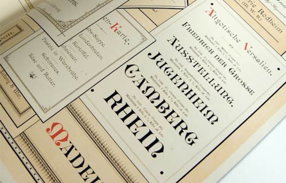
Serif fonts have small lines, flourishes, or “feet” attached to the ends of their letters. These decorative elements are called “serifs.” Look at the letters in Times New Roman, and you’ll notice tiny horizontal lines at the base of letters like “i” and “l,” and small finishing strokes on letters like “T” and “E.” Sans serif fonts lack these decorative elements entirely. The term “sans” comes from the French word meaning “without”—so sans serif literally translates to “without serifs.” These fonts have clean, straightforward letter endings. Arial and Helvetica are perfect examples of this streamlined approach.
This seemingly small difference creates dramatically different visual impressions and serves different practical purposes.
A Brief History: How Both Styles Evolved
Understanding the history of these font categories helps explain their different personalities and applications.
The Origins of Serif Fonts
Serif fonts are the older of the two styles, with roots tracing back to ancient Roman inscriptions. When Roman stonemasons carved letters into monuments, they added small finishing strokes to neaten the edges of their chisels’ marks. These practical additions became stylistic elements that carried forward into handwritten manuscripts and eventually into printed type.
When Johannes Gutenberg invented the printing press in the 15th century, he modeled his typefaces after the handwritten scripts of the time—which included serifs. For centuries afterward, virtually all printed text used serif fonts. This long history is why serif fonts often feel traditional, established, and authoritative.
The Rise of Sans Serif Fonts
Sans serif fonts emerged much later, first appearing in the early 19th century. Initially, they were considered strange and even ugly—early critics called them “grotesque,” a term still used to describe certain sans serif categories today.
However, the 20th century changed everything. The modernist design movement embraced sans serif fonts for their clean, functional appearance. Designers at the Bauhaus school championed these fonts as representing progress and modernity. When digital screens became prevalent, sans serif fonts gained even more popularity because their simple forms rendered more clearly on low-resolution displays.
Visual and Psychological Differences
Beyond their physical appearance, serif and sans serif fonts create distinctly different impressions in readers’ minds.
Serif Fonts Communicate:
- Tradition and heritage: Their historical roots make them feel established and time-tested
- Authority and credibility: There’s a reason academic papers and legal documents often use serif fonts
- Elegance and sophistication: Luxury brands frequently choose serifs for their refined appearance
- Seriousness and formality: Serif fonts signal that content should be taken seriously
When readers encounter serif fonts, they subconsciously associate the text with qualities like trustworthiness, expertise, and respectability. This psychological response has been shaped by centuries of seeing important documents—books, newspapers, official papers—printed in serif typefaces.
Sans Serif Fonts Communicate:
- Modernity and innovation: Their cleaner design feels contemporary and forward-thinking
- Simplicity and clarity: The absence of decoration suggests straightforward communication
- Approachability and friendliness: Sans serif fonts often feel more casual and accessible
- Efficiency and technology: Tech companies overwhelmingly prefer sans serif typography
Sans serif fonts create impressions of freshness, openness, and honesty. Their straightforward design suggests a brand or message with nothing to hide—what you see is what you get.
Readability: The Great Debate
One of the most discussed topics in typography is which font style is easier to read. The answer, as with many design questions, is: it depends.
The Case for Serif Readability
Traditional typographers have long argued that serif fonts are easier to read in printed body text. The theory suggests that serifs create a visual “flow” that guides the eye horizontally along lines of text. The small strokes connect letters visually, helping readers move smoothly from word to word.
This is why most printed books, newspapers, and magazines have historically used serif fonts for their main text. Publishers trusted that serifs reduced eye fatigue during extended reading sessions.
The Case for Sans Serif Readability
Digital designers often counter that sans serif fonts perform better on screens. The argument here is technical: screens display text using pixels, and the simple shapes of sans serif letters render more clearly, especially at small sizes or on lower-resolution displays. Serifs can appear blurry or muddy when squeezed into limited pixel space.
This explains why most websites, apps, and digital interfaces default to sans serif typography. Google’s switch to a sans serif logo in 2015 symbolized this digital-first design philosophy.
What Research Actually Shows
Modern studies suggest that familiarity matters more than font category. Readers perform equally well with both styles when they’re accustomed to them. The quality of the specific font, appropriate sizing, adequate line spacing, and good contrast all impact readability more significantly than whether a font has serifs or not.
The bottom line? Choose based on your medium, audience, and brand personality rather than assuming one category is universally “more readable.”
When to Use Serif Fonts
Serif fonts excel in specific contexts where their traditional qualities enhance the message:
Long-form printed content: Books, magazines, academic papers, and reports benefit from serif fonts’ proven readability on paper. If your audience will be reading extended text in print, serif is often the safer choice. Brands emphasizing heritage: Law firms, financial institutions, universities, and luxury brands often choose serifs to communicate established expertise and timeless quality. Formal communications: Wedding invitations, official certificates, formal letters, and executive presentations often call for serif typography’s dignified appearance. Editorial and publishing: Newspapers and literary publications traditionally favor serifs, though this is evolving in digital editions. When targeting older demographics: Studies suggest older readers often prefer serif fonts, possibly due to lifelong familiarity with printed books and newspapers.
When to Use Sans Serif Fonts
Sans serif fonts shine in contexts where modernity and clarity take priority:
Digital interfaces: Websites, mobile apps, and software interfaces typically perform better with sans serif fonts, especially for navigation elements, buttons, and smaller text. Brands emphasizing innovation: Tech startups, creative agencies, modern retailers, and health and wellness brands often choose sans serif to project a contemporary image. Minimalist designs: If your aesthetic is clean and uncluttered, sans serif fonts complement that philosophy perfectly. Signage and wayfinding: The clarity of sans serif fonts makes them ideal for signs, banners, and any text that must be read quickly from a distance. Younger audiences: Millennials and Gen Z readers have grown up with digital text and often respond well to sans serif typography. Headlines and display text: Even in publications that use serif body text, sans serif headlines create effective visual contrast.
Combining Serif and Sans Serif Fonts
One of the most powerful typography techniques involves using both styles together. This pairing creates visual hierarchy and interest while maintaining readability.
Classic Pairing Strategies
Sans serif headlines with serif body text: This popular combination offers the best of both worlds—attention-grabbing modern headers with comfortable, traditional reading text. Many magazines and websites use this approach. Serif headlines with sans serif body text: This reversed pairing works well for brands wanting a touch of elegance in their headers while maintaining digital-friendly body copy.
Tips for Successful Pairing
When combining serif and sans serif fonts, aim for contrast with harmony. Choose fonts that look distinctly different (so the pairing appears intentional) but share similar proportions or mood. Avoid pairing two fonts that are too similar—subtle differences look like mistakes rather than design choices.
Limit yourself to two fonts, or three at most. Using more creates visual chaos and dilutes the impact of each typeface.
Making Your Final Choice
When deciding between serif and sans serif fonts for your project, consider these factors:
Medium: Will this primarily be read in print or on screens? Audience: What are their expectations, preferences, and demographics? Brand personality: Does your message need to feel traditional or modern? Content type: Is this long-form reading or quick scanning? Context: What do competitors and industry standards suggest?
Remember that rules in typography are meant to be understood, not blindly followed. The “wrong” choice made intentionally and skillfully can sometimes create exactly the distinctive impression you’re seeking.
Conclusion: Two Tools, Infinite Possibilities
The difference between serif and sans serif fonts extends far beyond those tiny decorative strokes. These two categories carry centuries of history, psychological associations, and practical implications that influence how readers receive your message.
Serif fonts offer tradition, authority, and proven print readability. Sans serif fonts deliver modernity, clarity, and digital optimization. Neither is inherently better—they’re simply different tools for different jobs.
The best typographers understand both styles deeply and choose based on strategic thinking rather than personal preference. Now that you understand the fundamental differences between serif and sans serif fonts, you’re equipped to make typography decisions that truly serve your communication goals.
Whether you’re designing a brand identity, formatting a document, or building a website, let this knowledge guide your choices. The right font doesn’t just display your words—it amplifies them.
Typography tip: Start your next project by asking what feeling you want to create, then let that answer guide your choice between serif and sans serif fonts.