In the world of digital design, words convey a message, but typography conveys a feeling. Imagine reading a legal contract written in Comic Sans, or a heavy metal band’s logo designed in Helvetica. Something feels “off,” doesn’t it? That’s because fonts are the “voice” of your text.
Font trends are not merely aesthetic whims; they are reflections of our current culture, technology, and collective mood. In recent years, we have seen a massive shift from the ultra-minimalist “blanding” of the 2010s toward a more expressive, diverse, and human-centric approach to type.
Choosing the right typeface is no longer just a task for graphic designers; it is a critical business decision. A well-chosen font:
- Creates Visual Balance: It anchors your layout.
- Improves Aesthetics: It makes your site look professional and modern.
- Strengthens Brand Identity: It helps people recognize you instantly.
- Enhances User Experience (UX): It ensures your content is actually readable on a 6-inch smartphone screen.
In this guide, we will explore the psychology of type, and a step-by-step framework for choosing the perfect font for your project.
The Psychology of Type: Why Fonts Make Us Feel
Before we look at trends, we must understand the “why.” Typography triggers subconscious emotional responses. This is known as Font Psychology.
1. The Emotional Weight of Serifs vs. Sans-Serifs
- Serif Fonts (e.g., Times New Roman, Playfair Display): These evoke feelings of tradition, authority, and reliability. They feel “expensive” and “established.”
- Sans-Serif Fonts (e.g., Arial, Montserrat): These feel modern, approachable, and efficient. They are the “tech” fonts of the world.
2. The Power of “Personality”
Fonts can be masculine or feminine, loud or quiet, aggressive or friendly. For example, a heavy, bold font like Impact screams for attention, while a light, airy font like Inter suggests sophistication and clarity.
3. The Trust Factor
Consistency in typography builds a sense of safety. If a user moves from your Instagram to your website and the font style remains consistent, their brain registers your brand as “stable” and “trustworthy.”
What’s New in Font Trends? (2025–2026 Edition)
The pendulum of design is swinging back from the “clean and boring” era to something much more exciting. Here is what is dominating the landscape:
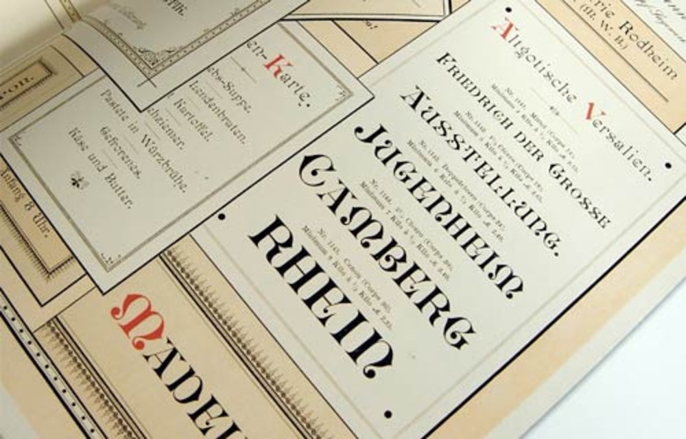
1. “New-Stalgia” (The 70s and 90s Revival)
We are seeing a massive resurgence of 1970s “groovy” serifs—think soft curves, thick strokes, and a psychedelic touch. Simultaneously, the 90s “grunge” and “pixel” aesthetics are returning for Gen Z-focused brands.
2. Kinetic and Variable Fonts
Technology has finally caught up with imagination. Variable fonts allow designers to customize weight, width, and slant on a sliding scale rather than being stuck with “Bold” or “Italic.” In 2026, expect to see more “Kinetic” typography—fonts that move or react to user scrolling.
3. “Humanist” Imperfections
In an era of AI-generated perfection, brands are craving the “human touch.” This means fonts that look slightly hand-drawn, irregular, or “wobbly.” It signals authenticity.
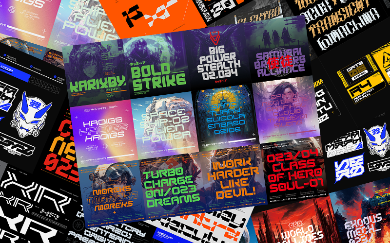
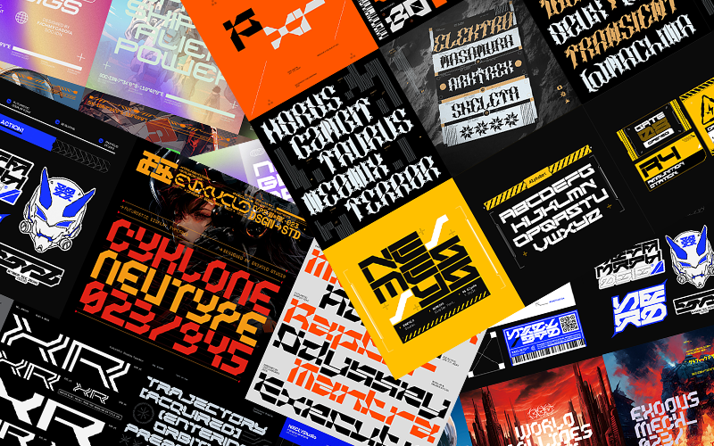
4. Maximalist Display Type
Big, bold, and taking up the whole screen. “Brutalism” in web design uses massive display fonts as the primary visual element, often replacing images entirely.
Key Considerations When Choosing a Typeface
Choosing a font can feel like picking a needle in a haystack. Use these nine filters to narrow down your choices:
1. Showcasing Brand Personality
List three adjectives for your brand. If you are “Eco-friendly, Calm, and Organic,” you might choose a soft, rounded Sans-Serif. If you are “Cutting-edge, Fast, and Bold,” a sharp, geometric typeface is better.
2. Legibility and Readability
These are two different things:
- Legibility: How easy is it to distinguish one letter from another? (Crucial for UI/UX).
- Readability: How easy is it to read long blocks of text? (Crucial for blogs).
3. Accessibility (The Inclusive Web)
Accessibility isn’t just a “nice to have”; it’s a legal and ethical requirement.
- Contrast: Ensure your font color stands out against the background.
- Dyslexia-friendly: Some fonts are easier for neurodivergent readers to process.
- Size: Never go below 16px for body text on the web.
4. Medium and Context
A font that looks stunning on a giant billboard might be unreadable on a smartwatch. Always test your font in the environment where it will live.
5. Consistency Across Channels
Your “Brand Book” should specify exactly which fonts to use for:
- H1 Headlines
- Body Paragraphs
- CTA Buttons
- Social Media Graphics
6. Trends vs. Timelessness
If you are building a “hype” brand for a summer pop-up, go trendy. If you are building a law firm that needs to last 50 years, choose a “workhorse” font like Garamond or Helvetica.
7. Cultural and Regional Fit
Typography carries cultural baggage. For example, “Blackletter” fonts are often associated with history and prestige in Europe, but can have different connotations elsewhere. Always research your target demographic.
8. Functionality
Does the font have all the characters you need? If your blog is in multiple languages, you need a typeface with a “Large Character Set” (including accents and special symbols).
9. Font Pairing (The “Power Couple” Rule)
Never use more than three fonts. A common strategy is:
- Font 1 (Heading): A bold, personality-driven Display font.
- Font 2 (Body): A highly legible, simple font.
- Font 3 (Accents): A script or mono font for small callouts.
Exploring Font Styles: The Big Four
| Font Category | Best For | Personality | Example |
| Serif | Print, Luxury, Academics | Traditional, Trustworthy | Garamond, Lora |
| Sans-Serif | Tech, Modern Blogs, Apps | Clean, Minimalist, Global | Inter, Open Sans |
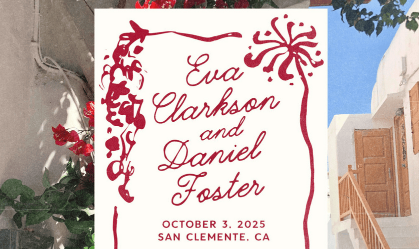
| Script | Weddings, Luxury, Creative | Elegant, Personal, Artistic | Great Vibes, Alex Brush |
| Display | Headlines, Logos, Posters | Bold, Eccentric, Unique | Bebas Neue, Playfair |
Deep Dive: Serif Fonts
Serifs are the “feet” at the end of letter strokes.
- Old Style: Low contrast between thick and thin lines (e.g., Caslon). Great for long reading.
- Modern/Didone: High contrast, very vertical (e.g., Didot). Perfect for fashion and high-end lifestyle brands.
- Slab Serif: Thick, block-like serifs (e.g., Rockwell). Excellent for grabbing attention.
Deep Dive: Sans-Serif Fonts
The “naked” fonts.
- Geometric: Based on circles and squares (e.g., Futura). Feels “architectural.”
- Humanist: Based on handwriting motions (e.g., Gill Sans). Feels more “natural.”
- Grotesque: The workhorses of the 20th century (e.g., Akzidenz-Grotesk).
How to Pair Fonts Effectively: A Science and an Art
Font pairing is where most non-designers get stuck. Follow these three proven formulas:
Formula 1: The “Same Family” Strategy
Use different weights of the same font family. Use Montserrat Bold for headlines and Montserrat Light for body text. It is impossible to mess this up.
Formula 2: The “Opposites Attract” Strategy
Pair a high-personality Serif (for the headline) with a neutral Sans-Serif (for the body).
- Example: Playfair Display + Source Sans Pro.
Formula 3: The “Concordant” Look
Pair two fonts that share a similar “x-height” (the height of the lowercase ‘x’). Even if the styles are different, they will feel like they belong together.
Top Resources for Font Inspiration and Selection
To stay ahead of the curve, you need to see what the world’s best designers are using. Bookmark these:
- Incredible Types: A curated collection of world-class typography.
- Fonts In Use: An archive of fonts used in real-world projects (magazines, posters, websites).
- Typewolf: The gold standard for seeing what’s trending in digital design.
- Google Fonts: The best place for free, open-source, web-optimized fonts.
- Typographica: High-level reviews of new typeface releases.
Your Type, Your Future
Typography is not an afterthought; it is the foundation of your visual communication. As we move further into 2026, the brands that stand out will be the ones that dare to be expressive while remaining accessible.
Remember:
- Audience First: Choose fonts they can read, not just fonts you like.
- Context Matters: Test your font on mobile and desktop.
- Hierarchy is King: Use size and weight to tell the reader what’s important.
The “Perfect Font” is the one that disappears. It should feel so natural that the reader doesn’t even notice they are reading—they simply absorb your message.