Font trends refer to the popular fonts designers commonly use today. In 2025, creativity in font selection is stronger than ever, with designers aiming to match fonts not only to style but also to the core message of their designs. Choosing the right font goes beyond aesthetics—it helps create visual harmony, define tone, and enhance the overall feel of a project.
Introduction About Font Trends
Effective typography guides and informs users, improves readability and accessibility, and ensures a positive user experience. Your typeface should capture your brand’s essence and clearly communicate your message. When typography aligns well with brand identity and messaging, it boosts recognition and builds customer loyalty over time.
Consistency matters — as users get familiar with font styles connected to your brand across different platforms like emails, websites, and social media, that familiarity strengthens trust.
Here are important considerations to guide your font choice for any project:
1. Express Brand Personality
Fonts are powerful communication tools that convey tone, meaning, and emotion. The right typeface allows you to express your brand’s unique character in ways words alone cannot. Understanding how fonts communicate will help you create content that resonates with your audience and reflects your brand’s voice.
2. Legibility and Readability
Legibility means how quickly a reader can recognize individual characters, while readability measures how easily they can understand the text as a whole. Font size, weight, style, and spacing between letters and words play a major role in both. Making your typography easy to read improves user satisfaction and accessibility.
3. Accessibility
Choose fonts that perform well across all media—digital devices and print alike. Select fonts that don’t tire the eyes, are clear for readers with varying visual abilities, and consider special needs such as dyslexia-friendly fonts. Prioritize readability at all sizes to maximize inclusivity.
4. Context and Medium
Consider where your font will appear. For logos, select distinctive fonts that are memorable and scalable globally. Serif fonts often work well for print and larger sizes, while sans-serif fonts excel in digital environments, providing clarity on screen.
5. Consistency and Cohesion
Consistent typography builds strong brand identity. Using the same fonts alongside matching colors and visuals across all platforms creates a unified and trustworthy brand image. Cohesiveness ensures your audience easily recognizes and remembers your message.
6. Trends vs. Timelessness
While trendy fonts can give your design a fresh and modern look, avoid relying solely on fleeting fads. Combining trendy elements with classic, timeless typefaces helps your design stay relevant long-term.
7. Cultural and Regional Sensitivity
Font perception can vary greatly by culture. What’s trendy and appealing in one region might not translate well in another. Always consider your target audience’s cultural background and regional preferences when selecting fonts to ensure positive reception.
8. Functionality
Prioritize fonts that serve your content’s purpose well. For example, serif fonts often work best for posters and printed materials, while sans-serif fonts are typically preferred for websites. The right choice balances aesthetic and practical needs for a seamless user experience.
9. Font Pairing
Effective pairing of fonts enhances visual harmony and ease of reading. Stick to consistent serif or sans-serif styles throughout your design, and consider font weight and style when combining to maintain a polished, cohesive look.
By factoring in these considerations, you can confidently select fonts that reflect your brand, amplify your message, and elevate your overall design.

Understanding Font Trends in 2025
The typography scene in 2025 is vibrant and dynamic, heavily influenced by nostalgia and futuristic themes simultaneously. Fonts draw inspiration from past eras while integrating modern sensibilities, reflecting how digital connectivity has broadened creative access to historical styles.
Current global challenges like economic uncertainties and geopolitical tensions have also motivated designers to embrace nostalgic motifs for comfort, while others explore bold, unconventional fonts symbolizing resilience and innovation.
Typography today celebrates diversity and eclecticism more than ever before, paralleling the rich range of voices seen in film, streaming, social media, and branding. Designers enjoy more freedom to experiment with various type styles that break free from traditional conformity.
This inclusive and daring spirit in typography can help businesses distinguish themselves in an increasingly digital and crowded marketplace, attracting attention through unique, well-thought-out font choices.
Key Factors When Choosing a Typeface
Selecting a typeface can be daunting—some prefer sticking with familiar fonts, while others endlessly search for perfection. Here’s a streamlined approach to simplify your decision-making:
- Purpose & Scope: Define where and how the font will be used. Will it be for a one-off project like a presentation or part of a larger brand identity? Ensure the font meets the flexibility needed.
- Digital vs. Print: Consider if the font will appear mainly online or also in print to pick styles appropriate for each medium.
- Audience: Tailor your font choice to your target demographics and cultural context.
- Practicality: Choose fonts optimized for legibility, accessibility, and user experience.
- Balance: Mix trendy and timeless fonts to maintain both modern appeal and lasting relevance.
Following these guidelines will help you make a smart, strategic font choice that enhances your project’s impact.

Exploring Different Font Styles
In today’s design landscape, font trends offer an extensive range of styles, from modern to classic, catering to all kinds of projects. Understanding these font categories can help you choose the perfect typeface for your needs:
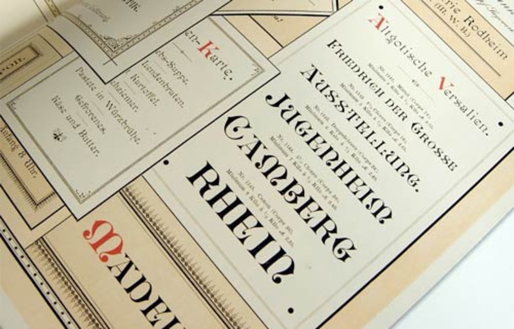
Serif Fonts
Serif fonts are distinguished by the small lines or strokes that extend from the ends of their characters, commonly referred to as “serifs.” These fonts often convey a sense of tradition and formality. Well-known serif typefaces include EB Garamond, Merriweather, Noto Serif, and Source Serif Pro. They are ideal for projects aiming to evoke credibility and timeless elegance.
Sans-Serif Fonts
Sans-serif fonts, as the name implies, omit the decorative serifs, featuring clean and straightforward letterforms. They encompass a broad range of styles: from the geometric precision of Futura to the humanistic touch of Frutiger, the bold impact of Franklin Gothic, and the modern refinement of Helvetica. Sans-serif fonts are especially popular in digital branding for their clarity and legibility on screens.
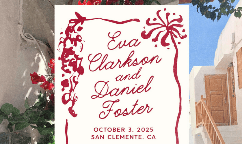
Script Fonts
Script typefaces mimic the fluid strokes of handwriting or calligraphy, adding a personalized and artistic flair to designs. These fonts, such as Refinsted, NCL Hubiny, and NCL Amhiney, are typically used decoratively in logos, invitations, and posters, bringing elegance and creativity to the visual message. They pair well with simpler fonts to create contrast and style.
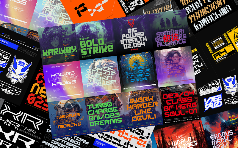
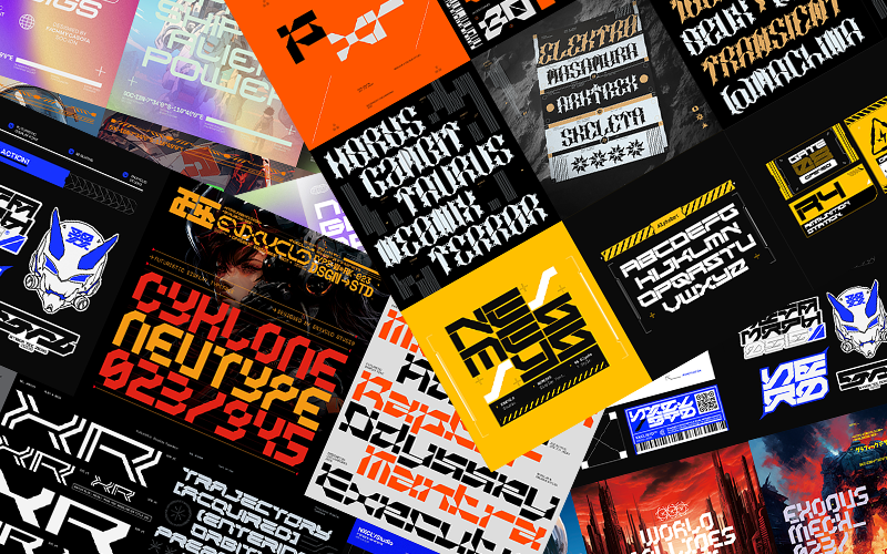
Display Fonts
Display fonts are crafted mainly for eye-catching, short-text applications like headlines, posters, billboards, and logos. They can be serif, sans-serif, script, or decorative—with some, like Bakego, incorporating intricate ornamentation designed for impact. Specialized versions of fonts like Helvetica Now enhance their appearance at larger sizes, making them perfect for striking visual statements.

Matching Typeface with Project Objectives
Choosing the right typeface goes beyond aesthetics—it’s about aligning your font choices with your brand identity and project goals to create meaningful connections with your audience.
- Know your brand: Reflect on your brand’s values, target audience, and tone. This insight helps select fonts that reinforce your message.
- Prioritize readability: Ensure your fonts are legible across various sizes and media. Consistency in font use strengthens brand recognition.
- Consider font characteristics: Serif fonts project tradition and seriousness, sans-serifs feel modern and clean, scripts add elegance, and decorative fonts inject personality for specific uses.
- Experiment and get feedback: Test combinations and gather opinions from colleagues or clients on how the fonts influence perception. Use constructive feedback to refine your choices.
- Evoke the right emotion: Select fonts that reflect the feelings you want your brand to evoke, creating a lasting and positive impression.
By thoughtfully selecting and combining fonts based on these principles, you can effectively communicate your brand’s personality and foster stronger audience engagement.

Testing the Pairing of Fonts
Typography plays a crucial role in logo design, and selecting the right fonts is essential to effectively convey your business’s identity and values. Strategically pairing two fonts in your design can make your logo more distinctive and memorable. However, it’s important to follow proven guidelines instead of randomly mixing font styles.
When testing font pairings, assess readability and legibility at different sizes. Combining font sizes that contrast in weight or width, such as pairing a bold, chunky font with a slender, delicate one, helps establish a clear visual hierarchy while serving diverse design purposes. This contrast creates balance and adds visual interest.
To make font pairing easier and cohesive, try selecting fonts from the same font family or typeface family. Additionally, adjust kerning (letter spacing) to differentiate text sections and add subtle variation.
Finding the right balance of contrast and harmony is key. Pair fonts that complement each other by creating contrast without clashing. Avoid fonts that are too similar, as they blur differentiation, as well as fonts that are too different, which may cause confusion.
A simple yet effective font pairing example is combining minimalist fonts with handwritten script fonts. This blend offers both contrast and harmony, adding personality without compromising readability.

Staying Informed with Font Trends
To stay inspired and updated in the world of typography, explore these valuable websites showcasing the latest font trends and timeless typeface choices:
- Incredible Types: A rich, organized collection of 426 font trend ideas inspired by creatives worldwide.
- Type Hunting: Started as a personal font repository, now a blog featuring fresh font trends and design inspiration.
- NYC Type: A unique archive featuring font styles found in New York City’s boroughs with street photography of letters.
- Fonts In Use: A public archive categorizing font trends by industry, format, and period, with plenty of graphic design examples.
- Typespiration: An inspirational collection by online designers featuring minimalistic, portfolio, eCommerce, and blog typography.
- Typographica: Since 2002, providing reviews of typefaces, type books, and insights into font design and trends.
- Fridayfonts: Showcases type experiments and student lettering assignments from typography seminars and courses worldwide.
- I Love Typography (ILT): Combines a popular inspiration blog with an online marketplace offering a wide range of fonts and licenses.
- Creative Market: A marketplace offering diverse font trends including brushes, hand-drawn, and vector letterforms perfect for web projects.
- Enxyclo Studio: this typefoundry has an awesome blog about font and typography
Consistently exploring these resources helps you blend modern fonts with timeless choices, creating designs that feel both fresh and enduring, ultimately attracting your target audience.
Conclusion
Font trends play a vital role in choosing the right typeface for every design project. Staying up-to-date with the latest trends, understanding your project’s environment, and carefully selecting fonts ensures your design delivers the desired impact.
By appreciating font choices, designers can effectively communicate brand identity, improve readability and accessibility, ensure design consistency, and leave a lasting impression on audiences.
When selecting typefaces, consider your project’s purpose, brand identity, readability, and target audience. Match the appropriate font trends—whether serif, sans-serif, script, or display—to your project objectives.
Testing font combinations to establish visual balance is essential, and so is staying informed through reputable typography websites. This ensures your brand identity or logo stays current and compelling.
Ultimately, the right typeface communicates your brand’s personality, creates a positive first impression, and fosters a meaningful connection with your audience.
Designers who stay educated on font trends, experiment with thoughtful font pairings, and seek constructive feedback can confidently make choices that elevate their designs and strengthen their brand presence.