Fonts are more than just letters on a page or screen—they are powerful tools that communicate your brand’s personality, values, and tone. The right font can evoke emotions, build trust, and make your brand memorable. For example:
- Sony uses Clarendon, which conveys clarity and directness.
- Coca-Cola uses Spencerian Script, which feels casual, cool, and high-spirited.
Choosing the right font is crucial because it shapes how your audience perceives your brand.
7 Essential Tips for Choosing Brand Fonts
1. Match Fonts to Your Brand Personality
- Your font should reflect your brand’s character and personality.
- Great brand fonts are unique, legible, versatile, and embody your business identity.
- Consider the emotions fonts evoke:
- Slab Serif fonts suggest boldness and impact.
- Mono-spaced fonts convey sophistication and tech-savviness.
2. Prioritize Clarity and Readability
- Never sacrifice readability for style.
- Consider font size, weight, spacing, and color contrast.
- Some fonts work better on screen (e.g., Sans Serif), others on print (e.g., Serif).
- Avoid overly decorative or cursive fonts like Vivaldi for brand names, as they can be hard to read.
3. Serif vs. Sans Serif: Know When to Use Each
| Font Type | Best For | Characteristics | Examples |
| Serif | Short text, professional brands | Traditional, reputable, authoritative | Times New Roman, Georgia, Lucida |
| Sans Serif | Long text, younger audiences, accessibility | Clean, modern, easy to read on screens | Arial, Verdana, Tahoma |
- Serif fonts suggest professionalism and authority.
- Sans Serif fonts are more approachable and accessible, especially for younger or visually impaired audiences.
4. Choose Versatile Fonts
- Your brand fonts will be used across many platforms: print, web, mobile, billboards, business cards, etc.
- Ensure fonts look good at all sizes and in different media.
- Examples of versatile fonts:
- Futura (used by Nike, Dolce & Gabbana)
- Myriad Pro (LinkedIn)
- Helvetica (Energizer)
5. Narrow Down Your Choices
- Too many options can be overwhelming.
- Start with 3-5 fonts and test how they work for your brand.
- Compare fonts side by side and seek feedback from trusted peers.
- Remember, your brand fonts are for your audience, so their opinions matter.
6. Use Two Fonts Wisely
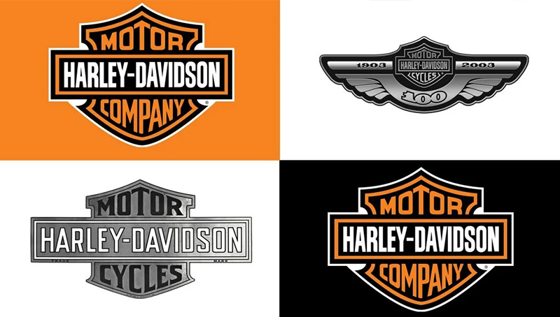
- If using two fonts, avoid ones that are too similar.
- Aim for contrast and harmony to create visual interest and hierarchy.
- Examples of brands using two fonts effectively:
- JAC Motors
- Whole Foods Market
- Harley Davidson Motor Cycles
- Make sure the hierarchy is clear so customers know which font is primary.
7. Understand Font Licensing
- Check the license before using a font commercially.
- Some fonts are free but have restrictions (e.g., free for promotional use but not for products sold).
- Paid fonts often come with broader usage rights.
- Always read the license terms carefully to avoid legal issues.
Summary Table: Key Font Selection Factors
| Factor | What to Consider | Examples/Notes |
| Brand Personality | Does the font reflect your brand’s character? | Slab Serif = bold, Mono-spaced = tech |
| Readability | Is the font clear at all sizes and platforms? | Avoid cursive for logos |
| Serif vs. Sans Serif | Serif for authority, Sans for modern & accessibility | Times New Roman vs. Arial |
| Versatility | Works across print, web, mobile, large & small | Futura, Helvetica |
| Number of Fonts | Limit to 2 fonts with clear contrast | Avoid similar fonts |
| Licensing | Check commercial use rights | Free vs. paid fonts |
Final Thoughts
Selecting the right brand fonts is a strategic decision that can take time but pays off in building a strong, memorable brand identity. By following these tips, you can confidently choose fonts that not only look great but also communicate your brand’s essence effectively.