Great font pairing is like great conversation—two distinct voices working together to create something more powerful than either could alone.
You’ve found the perfect headline font. It’s bold, beautiful, and captures your brand’s personality flawlessly. But now comes the challenge that stumps even experienced creators: what font do you pair it with?
Font pairing—the art of combining two or more typefaces harmoniously—separates amateur designs from professional ones. When done well, paired fonts create visual hierarchy, guide readers through content effortlessly, and add sophistication to any project. When done poorly, they clash awkwardly and undermine your entire design.
The good news? Font pairing isn’t mysterious intuition reserved for design school graduates. It follows learnable principles that anyone can master. In this guide, you’ll discover exactly how designers approach font combinations and learn techniques to pair fonts confidently in your own projects.
Why Font Pairing Matters
Before exploring techniques, let’s understand why pairing fonts is worth your attention.
Single-font designs can work beautifully in certain contexts—minimalist logos, for instance. But most real-world projects involve different types of content: headlines, body text, captions, pull quotes, navigation elements, and calls to action. Using one font for everything creates visual monotony and makes it harder for readers to understand content hierarchy.
Strategic font pairing solves this problem. Different fonts signal different content types, helping readers navigate instinctively. A bold sans serif headline tells readers “this is important—start here.” A comfortable serif body font says “settle in and read.” A distinctive accent font highlights “pay special attention to this.”
Beyond functionality, well-paired fonts create aesthetic richness. They add visual interest, establish mood, and demonstrate design sophistication. Your font choices signal professionalism and attention to detail—or the lack thereof.
The Fundamental Principle: Contrast with Harmony
Every successful font pairing balances two seemingly opposite goals: creating enough contrast to be interesting while maintaining enough harmony to feel cohesive.
Contrast makes pairings dynamic. When fonts look too similar, the subtle differences appear accidental rather than intentional. Readers sense something is off without knowing why. Distinct fonts, however, clearly belong to different categories serving different purposes. Harmony keeps pairings unified. Fonts that contrast too dramatically—with nothing in common—feel chaotic and disconnected. They fight for attention rather than working together. Harmonious pairings share underlying qualities that create visual unity.
Think of font pairing like choosing an outfit. You want pieces that complement each other without matching exactly. A navy blazer and khaki pants create interesting contrast while sharing a classic, professional mood. Similarly, a traditional serif headline and a clean sans serif body font contrast in style while harmonizing in sophistication.
This balance between contrast and harmony guides every technique that follows.
Five Proven Font Pairing Strategies
Designers rely on tested approaches when combining fonts. Master these strategies, and you’ll handle most pairing challenges confidently.
Strategy 1: Serif Plus Sans Serif
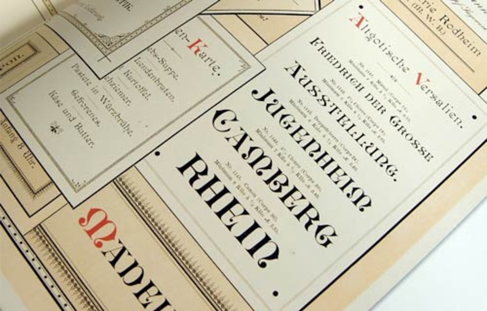
This classic combination is the most reliable pairing strategy and an excellent starting point for beginners. Serif and sans serif fonts contrast obviously—one has decorative strokes, one doesn’t—while often sharing similar proportions and mood.
How to execute it well:
Use the more distinctive font for headlines and the more neutral font for body text. If your serif has strong personality, let it shine in headlines while a clean sans serif handles readable body copy. Alternatively, a bold sans serif headline paired with an elegant serif body creates sophisticated editorial feeling.
Match the mood of both fonts. A modern geometric sans serif pairs naturally with a contemporary serif. A humanist sans serif complements traditional serif designs. Avoid pairing fonts from completely different eras or design philosophies.
Example combinations:
- Playfair Display (serif) + Source Sans Pro (sans serif)
- Montserrat (sans serif) + Merriweather (serif)
- Oswald (sans serif) + EB Garamond (serif)
Strategy 2: Different Weights from One Family
The safest pairing approach uses fonts from the same family. Type designers create font families with multiple weights and styles specifically intended to work together. You get built-in harmony with zero risk of clashing.
How to execute it well:
Choose a font family with significant weight variation—ranging from light to bold or even black. Use the heaviest weights for headlines and lighter weights for body text. The contrast comes from weight difference rather than different typefaces.
Many comprehensive font families also include both serif and sans serif versions designed to complement each other. These “superfamilies” offer tremendous flexibility while guaranteeing compatibility.
Example combinations:
- Roboto Bold (headlines) + Roboto Regular (body)
- Raleway Black (headlines) + Raleway Light (body)
- Noto Sans (headlines) + Noto Serif (body)—same superfamily
Strategy 3: Contrast in Style, Unity in Structure
This more advanced strategy pairs fonts that look different but share underlying structural similarities. When fonts have comparable x-heights (the height of lowercase letters), similar letter proportions, or matching geometric foundations, they harmonize despite surface-level differences.
How to execute it well:
Examine the architecture of potential pairings. Look at letters like “o,” “e,” and “a” in both fonts. Do they share similar shapes? Are the proportions comparable? Fonts built on similar geometric principles—both based on circles, for instance—often pair well even when they look quite different at first glance.
This strategy requires more careful evaluation but produces sophisticated, distinctive combinations.
Example combinations:
- Futura (geometric sans serif) + Bodoni (high-contrast serif)—both have geometric foundations
- Gill Sans (humanist sans serif) + Baskerville (transitional serif)—both have classical proportions
Strategy 4: Script or Display Font Plus Neutral Workhorse
Script fonts and decorative display fonts demand attention—that’s their purpose. They pair best with neutral, understated fonts that provide contrast without competition.
How to execute it well:
Use the script or display font sparingly—for logos, headlines, or accent text only. Never use decorative fonts for body copy. Pair them with clean, simple fonts that step back and let the statement font shine.
The neutral partner should be highly readable and relatively anonymous. Its job is supporting the star, not stealing the spotlight.
Example combinations:
- Pacifico (script) + Open Sans (neutral sans serif)
- Lobster (display) + Lato (clean sans serif)
- Great Vibes (elegant script) + Montserrat (modern sans serif)
Strategy 5: Create Contrast Through Size and Treatment
Sometimes the pairing magic happens not through font selection but through how you use fonts. Dramatic size differences, varied capitalization, adjusted spacing, and different colors can create sufficient contrast even between similar fonts.
How to execute it well:
Make headlines significantly larger than body text—not just slightly bigger, but dramatically different in scale. Use all-caps treatment for one element and sentence case for another. Adjust letter spacing (tracking) to differentiate headlines from body copy.
This approach works particularly well when you want a cohesive, minimalist aesthetic but still need clear hierarchy.
Practical Tips for Better Font Pairing
Beyond core strategies, these practical techniques will improve your pairing results.
Limit yourself to two or three fonts maximum. More fonts create visual chaos. Most professional designs use just two: one for headlines and one for body text. A third accent font can work for special elements, but rarely is more needed.
Establish clear hierarchy. Each font should have a defined role. Readers should instantly understand which text is most important, which is supporting content, and which is supplementary. If your fonts compete rather than complement, the hierarchy fails.
Test with real content. Never evaluate pairings using placeholder text alone. Type actual headlines and paragraphs from your project. Certain letter combinations reveal compatibility issues that generic samples miss.
Consider the context and medium. Pairings that work in print may struggle on screens, and vice versa. Always test your combinations in their intended environment at realistic sizes.
Trust your instincts, but verify them. If a pairing feels wrong, it probably is—even if you can’t articulate why. But also gather feedback from others. Sometimes we become blind to issues after staring at designs too long.
Common Font Pairing Mistakes to Avoid
Learning what not to do is equally valuable. Watch out for these frequent errors.
Pairing fonts that are too similar. Two sans serifs with slight differences look like a mistake, not a choice. If fonts are going to differ, make the difference obvious and intentional.
Ignoring mood compatibility. A playful, bouncy font paired with a stern, formal one creates tonal confusion. Both fonts should feel like they belong in the same universe.
Using two attention-seeking fonts. If both fonts demand the spotlight, neither gets it. One font should lead while the other supports.
Forgetting about readability. Aesthetic harmony means nothing if readers can’t comfortably consume your content. Body text especially must prioritize legibility over style.
Overcomplicating simple projects. Not every design needs creative font pairing. Sometimes one well-chosen font family handles everything beautifully. Complexity for its own sake isn’t good design.
Building Your Font Pairing Intuition
Like any skill, font pairing improves with practice and observation. Start noticing typography everywhere—magazines, websites, packaging, signage. When a design catches your eye, analyze what fonts are used and why they work together.
Build a personal collection of successful pairings you discover. Many designers maintain inspiration files or Pinterest boards dedicated to typography combinations. These references accelerate future projects.
Experiment freely in low-stakes situations. Try unexpected combinations. Some won’t work, and that’s fine—you’ll learn from failures. Occasionally, you’ll discover surprising pairings that break conventional rules yet somehow succeed brilliantly.
Conclusion: Pairing Fonts with Confidence
Font pairing intimidates many people, but it doesn’t have to. The core principle is simple: create contrast while maintaining harmony. The five strategies outlined here—serif plus sans serif, same family different weights, structural similarity, statement plus neutral, and contrast through treatment—cover the vast majority of pairing situations you’ll encounter.
Start with safer combinations as you build confidence. Serif plus sans serif pairings and same-family weight variations offer reliable results with minimal risk. As your eye develops, experiment with more nuanced approaches.
Remember that font pairing serves communication first. The goal isn’t showing off typographic knowledge—it’s helping readers navigate and enjoy your content. The best pairings feel so natural that readers never consciously notice them. They simply experience content that’s clear, hierarchical, and visually pleasing.
Now open your next project and start experimenting. With these principles guiding you, you’re ready to pair fonts like a designer.
Quick-start tip: Begin your next project by choosing one font you love for headlines, then find its opposite in style but equal in quality for body text. That contrast-with-harmony approach works more often than not.