Your brand’s typography speaks before your words do. Here’s how to make sure it says the right thing.
When you think about iconic brands like Coca-Cola, Google, or Netflix, their logos probably pop into your mind instantly. But have you ever stopped to consider why? A significant part of that instant recognition comes from their carefully chosen typography. The font you select for your brand isn’t just a design choice—it’s a strategic business decision that shapes how customers perceive, remember, and connect with your company.
In this comprehensive guide, we’ll walk you through everything you need to know about choosing the perfect font for your brand. Whether you’re launching a startup or refreshing an established business identity, these principles will help you make typography decisions with confidence.
Why Typography Matters More Than You Think
Before diving into the selection process, let’s understand why fonts deserve your careful attention. Studies in consumer psychology have consistently shown that typography influences purchasing decisions, brand trust, and emotional responses. A font can make your brand appear luxurious or affordable, modern or traditional, playful or serious—all without saying a single word.
Consider this: if a law firm used a playful, bubbly font like Comic Sans, would you trust them with your legal matters? Probably not. That’s the power of typography at work. Your font choice creates an immediate, often subconscious impression that can either attract or repel your target audience.
Understanding the Four Main Font Categories
The first step in choosing your brand font is understanding the basic categories available to you. Each family of fonts carries its own psychological associations and practical applications.
Serif Fonts
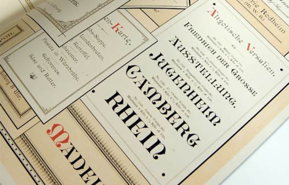
Serif fonts feature small decorative strokes (called “serifs”) at the ends of letters. Think of fonts like Times New Roman, Georgia, or Garamond. These fonts have been around for centuries and are often associated with tradition, reliability, authority, and sophistication.
Best for: Law firms, financial institutions, luxury brands, academic organizations, and publications. If your brand values heritage, trustworthiness, and established expertise, serif fonts are worth considering.
Sans-Serif Fonts
Sans-serif fonts lack those decorative strokes, resulting in clean, modern letterforms. Popular examples include Helvetica, Arial, and Futura. These fonts communicate simplicity, efficiency, innovation, and approachability.
Best for: Tech companies, startups, modern retailers, health and wellness brands, and any business wanting to project a contemporary image. Sans-serif fonts also tend to perform better on digital screens, making them excellent choices for brands with a strong online presence.
Script Fonts
Script fonts mimic handwriting or calligraphy, ranging from elegant and formal to casual and fun. Examples include Pacifico, Great Vibes, and Lobster. These fonts evoke creativity, elegance, femininity, and personal touch.
Best for: Beauty brands, wedding services, bakeries, boutique shops, and creative agencies. However, use script fonts sparingly—they can be difficult to read in large blocks of text or at small sizes.
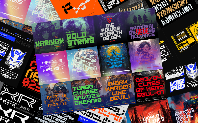
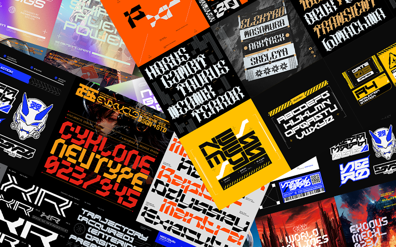
Display Fonts
Display fonts are decorative typefaces designed to grab attention. They’re often bold, unique, and highly stylized. These fonts communicate boldness, creativity, and distinctiveness.
Best for: Entertainment brands, children’s products, food and beverage companies, and any brand wanting to make a strong visual statement. Display fonts work best for headlines and logos rather than body text.
Step-by-Step Guide to Choosing Your Brand Font
Now that you understand the basics, let’s walk through the practical process of selecting your ideal typography.
Step 1: Define Your Brand Personality
Before browsing font libraries, get crystal clear on your brand identity. Ask yourself these questions:
- What three adjectives best describe your brand?
- Who is your target audience, and what appeals to them?
- What emotions do you want customers to feel when interacting with your brand?
- How do you want to be perceived compared to competitors?
Write down your answers. If your brand personality includes words like “innovative,” “minimal,” and “forward-thinking,” you’re likely looking at sans-serif territory. If “elegant,” “established,” and “premium” describe your brand, serif fonts might be your match.
Step 2: Research Your Industry and Competitors
Take time to analyze what fonts successful competitors and industry leaders use. This research serves two purposes: understanding audience expectations and identifying opportunities for differentiation.
You don’t want to copy competitors, but you also don’t want to choose something so drastically different that it confuses your audience. A tech startup using an ornate Victorian font might stand out, but not in a good way. Find the balance between fitting in enough to be recognized as part of your industry while standing out enough to be memorable.
Step 3: Prioritize Readability and Versatility
A beautiful font is worthless if people can’t read it. When evaluating fonts, test them across multiple scenarios:
- Different sizes: Does it remain legible at very small sizes (like footer text) and very large sizes (like billboards)?
- Different backgrounds: Does it work on both light and dark backgrounds?
- Different mediums: How does it look printed versus on screen?
- Different contexts: Can you imagine it on business cards, websites, packaging, and social media?
Your primary brand font should be versatile enough to work across all your marketing materials. If a font only looks good in one specific context, it’s probably not the right choice for your main brand typography.
Step 4: Consider Font Pairing
Most brands use two to three fonts: one for headlines, one for body text, and sometimes a third for accents or special purposes. The art of font pairing involves selecting typefaces that complement each other without competing for attention.
Some classic pairing strategies include:
- Serif + Sans-Serif: This timeless combination creates visual contrast while maintaining harmony. Use the serif for headlines and sans-serif for body text, or vice versa.
- Same Family, Different Weights: Many font families include light, regular, bold, and extra-bold versions. Using different weights from the same family ensures cohesion.
- Contrast in Style, Unity in Mood: Pair fonts that look different but feel similar in personality. A modern serif and a geometric sans-serif can work beautifully together if they share a sophisticated mood.
Avoid pairing fonts that are too similar—the subtle differences will look like mistakes rather than intentional choices.
Step 5: Test with Real Content
Never make a final decision based on how a font looks displaying “Lorem ipsum” or the alphabet. Test your shortlisted fonts with actual brand content:
- Your company name and tagline
- Sample headlines from your marketing materials
- A paragraph of your typical website copy
- Your product names or service descriptions
See how the fonts perform in real-world applications. Sometimes a font that looks stunning in isolation falls flat when applied to your actual content.
Step 6: Check Licensing and Availability
This practical step is often overlooked but critically important. Before falling in love with a font, verify:
- Licensing terms: Can you use it commercially? Are there restrictions on certain applications?
- Cost: Is it a one-time purchase, subscription-based, or free?
- Web font availability: If you need it for your website, is a web font version available?
- Universal access: Can your team, designers, and partners easily access and use the font?
Many beautiful fonts come with licensing fees, which is perfectly reasonable—type designers deserve compensation for their work. Just factor these costs into your branding budget.
Common Typography Mistakes to Avoid
As you make your selection, steer clear of these frequent pitfalls:
Using too many fonts. Stick to two or three maximum. More than that creates visual chaos and dilutes brand recognition. Choosing trendy over timeless. While it’s tempting to use the latest popular font, trends fade quickly. Your brand typography should have staying power. Ignoring accessibility. Ensure your fonts are readable for people with visual impairments. Avoid extremely thin weights, overly decorative scripts, or low-contrast color combinations. Forgetting about international characters. If your brand operates globally, verify that your chosen fonts support all necessary character sets and languages.
Final Thoughts: Trust the Process
Choosing the right font for your brand is both an art and a science. It requires understanding design principles while trusting your instincts about what feels right for your unique brand identity.
Don’t rush the process. Live with your shortlisted options for a few days. Show them to people who represent your target audience and gather feedback. The right font should feel like a natural extension of your brand—so fitting that you can’t imagine your business without it.
Remember, typography is one piece of your larger brand puzzle. When chosen thoughtfully, your font becomes a powerful tool that reinforces your message, builds recognition, and creates meaningful connections with your audience.
Your brand has a voice. Make sure your typography speaks it fluently.